
Description:
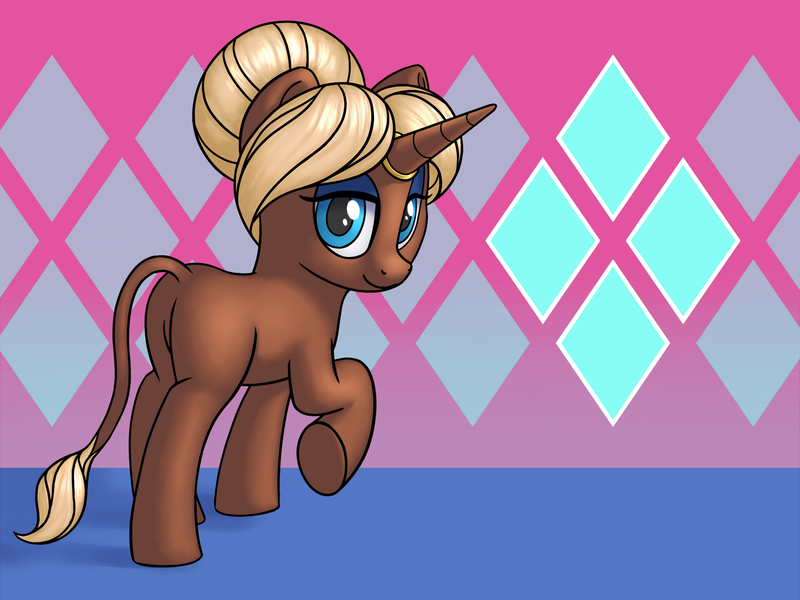
The guardian of Greenridge, from the game Super Lesbian Animal RPG.
A game I definitely recommend to anyone reading this.
I started this months ago when I played it, but unfortunately I'm still struggling to finish artworks in a reasonably short amount of time.
Well, on the positive side, it means I get to post this around SLARPG's 1 year anniversary.
[There's a few alternate versions linked at the bottom if you're interested.
Including the original picture size, 2x bigger than this one.]
When I first saw this game, it was someone else's playthrough.
I was curious and decided to watch the start of it.
After 1 hour, I knew I wanted to play it for myself.
It turns out it's great. (Also wow the soundtrack is really good.)
Turn-based combat is not something I like most of the time.
Unless its got some real-time aspect, or maybe another interesting thing.
But this one.. I found it alright for some reason.
It probably helps that for my first ever purely turn-based rpg experience, it's not that hard.
After finishing it though, I would like if it had a harder mode I could do a 2nd playthrough on.
Bobby (the creator) has mentioned that a hard mode "will happen at some point, hopefully sooner rather than later."
But she can't estimate when it'll be done, so we'll just need to give her the time she needs.
For now though, if you decide to play it before that mode gets added..
If you're experienced at turn-based combat, and/or want a challenge playing SLARPG, I'd suggest intentionally using weaker weapons and armour, and perhaps using the EXP-reducer item found in the shops.
It might not be the same kind of difficulty a true hard mode could offer, but it's an option at least.
Even if you just want an average amount of difficulty, you won't need to grind enemies for exp.
Not if you do sidequests and don't flee from battles.
But the game does have an easy option and areas to fight for quick exp if you want to be overpowered or are more interested in the story.
After playing this I'm wondering if maybe there's other turn-based games I might like too.
Maybe turn-based combat isn't always a dealbreaker for me. It just needs to be enjoyable.
Super Lesbian Animal RPG's characters and story are great.
And the jokes.
The art is nice too.
Actually, there's even a short prequel comic on the official site. I read it afterwards, but I don't think it would matter if you read it before playing.
THE MUSIC.
It's really good.
That's.. all I'll say about it.
You'll just have to listen to it yourself.
Hearing it in-game is a better experience since that's what it was made for.
But, if you're not interested in playing the game, at least listen to it on its' own.
This game apparently started as an MLP fan-game, before becoming it's own thing.
So ponyfying a character is quite fitting.
Although I might have drawn one or more characters as they appear in-game if I was capable of drawing humanoid/anthro characters.
I do want to work more on that in 2024. Properly learn how to draw humans.
Then I should have an easier time with anthro art.
[Additional notes I wanted to write out regarding the creation process, feel free to ignore]
As for the picture here..
I STILL haven't managed to get focused on learning how to draw environments yet. I really want to start, but I don't want to give myself too many things to be trying to learn all at the same time, so I don't know when to begin. I'd still like to improve my anatomy/proportions, perspective, lineart and rendering.
So for now, I made another simple background.
It took a bit of time to figure that out too though.
Well, it's not the best, but I can live with it.
I do like the pattern I put in, something that fits with the character.
THE HAIR.
For a while I've been trying to get better at hair.
The last finished piece was a start, but I really wanted to do better this time.
Figuring out where to put lineart in the hair to create sections, without it looking weird or incorrect is quite hard.
This time I stuck with only closed lines, no short lines coming from the sides of the sections and ending midway through the hair. It was just not looking right when I tried them.
After I'd done the lines (and the colours,) it was time to attempt to create texture using shading/rendering.
If I couldn't manage to create a sense of texture with the linework yet, I could at least do so here.
I tried multiple techniques that I could find online. After practicing just on hair texture for a while, I finally found a process which felt ok.
I'm unsure how much I like this new hair texture, but I don't think it looks bad.
It's weird because when I've drawn hair and added texture with lines and shading with a pencil on paper, I think I can do it fairly well. Not amazing, but still pretty decent.
But trying to do it the same way digitally just doesn't work.
Maybe I just need to reconfigure my paint program settings, or maybe I need to use a different brush, or a different program?
The shading/rendering.
I'm not sure what aspect made me take so long to finish this picture.
I didn't work on it every day from start to finish, there were a lot of days I spent away from it.
But I think it's figuring out how to render it which caused the most trouble.
After struggling with placing the shadows, I'd often get discouraged from working on it for days before I could get myself to try again.
This includes the cast shadow on the ground too.
It's the last thing I worked on before finishing.
Eventually I settled on this, but the one thing I couldn't figure out for days was where to place the shadow of the raised limb.
I tried over and over. I tried drawing lines from the lightsource direction and a wireframe cylinder over it.
I'm not sure I got it right, but I'm satisfied enough that it might be somewhat accurate.
I considered not having any ground shadow, but it just felt wrong to me.
Oh, and the shadow was much sharper initially. Which made getting it right even harder.
So I went for a mostly blurred one as a compromise.
If I hadn't, I might still be trying to get it right.
Shading is hard. Still a lot of work to do to improve.
I tried a different blending brush for the body shadow edges, and I'm unsure if it looks better than the one I've used before.
I think usually I blend the edges too much, so I tried to leave a bit more of a visibly harder-edged shadow-shape.
The lineart.
I want to make my lines look nicer.
One way to do that is lineweight.
Not that uniform line thickness is always "worse," it's just not what I'd prefer to draw.
I've been trying to increase the range between thick and thin for a while now.
I'm getting a little better, but it's still not looking all that great, to me at least.
It should be thicker for parts that overlap, but also for things that are closer, but also for emphasizing points of interest, but also for the silhouette outline, but also for areas in shadow, but thinner for smaller details, but... HOW. How do I figure out when I should do one type over another, or should I try to make some lines fit multiple types simultaneously?
Values.
I don't usually pay attention to the values in a picture I'm making.
But I know it's something I should work on, so this time I tried looking at it in greyscale.
When drawing existing characters I always pick the colours directly from existing art of them, official art if possible, to maintain accuracy.
This time, it turns out that the values tied to them were pretty good, except for perhaps the blue of the eyelids. So I adjusted the colour slightly, to make them a bit more noticeably different from the face colour/value when in greyscale.
I didn't want to stray too far away from the initial colour though, which is why the values are still pretty close.
I need to practice values in a focused manner in the future, but for now just staying aware of them and adjusting accordingly is good.
In fact.. here you go.
I like how the picture looks in greyscale so I'll give you a link to a few versions of it.
There's fully black and white. > [sta.sh/0134ufip61be](sta.sh/0134ufip61be)
There's B&W with the golden horn ring. > [sta.sh/013i1dsvw8te](sta.sh/013i1dsvw8te)
There's B&W with that + the iris-blue of the eyes. > [sta.sh/09cvz8un786](sta.sh/09cvz8un786)
And B&W with that + the blue eyelids. > [sta.sh/034ao5hzlbz](sta.sh/034ao5hzlbz)
Oh, and here's the Original size version if you'd prefer that. > [sta.sh/0gqxeuuc6m9](sta.sh/0gqxeuuc6m9)
I wasn't sure about making that the main version, I didn't think it needed to be that big, but it's there if you want it.