Description:
hello i have some strong feelings about how littlepip is often designed.
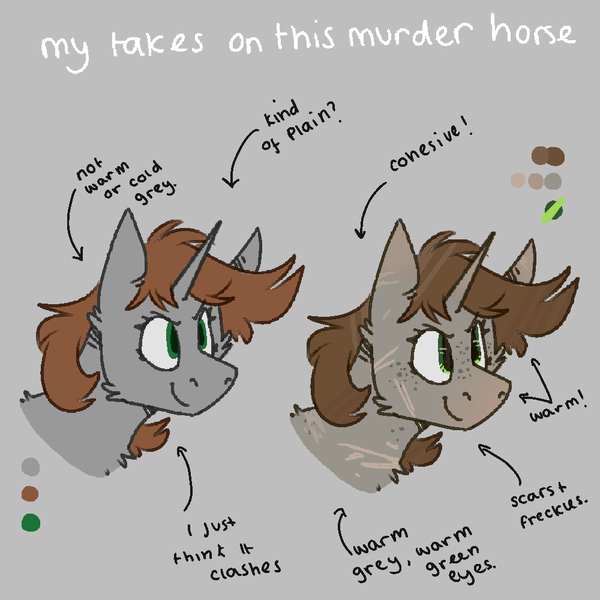
I think the first design, how she's often drawn, is easy. It's easy to look at and understand and especially easy to animate, which I assume was part of the point, but...I don't like it. I think it's incoherent, I think it clashes, I don't think there's much real decision behind why the colours are the way that they are. Plus I don't like plain, genuine grey on characters (blue makes it look brown, brown makes it look blue, it's just not very good at doing what you want it to do.) it echoes a lot of early community show design puritanism for me, and I'm just not very fond of it, and the same goes for a lot of the OG designs of the FOE characters.
Is my design neccecarily right? no, but that's how I like to draw murder horse. I like how scars can show how long she might have been in the wasteland, what sort of a pony she is, pointing is a personal taste but all the colours on there are coherent and chosen for a reason. They're all warm, and don't clash, the green goes with how I draw green on pipbucks, the pointing is more horse-y (and just something I like to add to my characters) and it isn't boring.
Is it easy to animate/simple? No, but it can be. I'll always be a browngrey littlepip drawer, I want to get to a point where I make little sheets like this for a lot of FOE characters.
I also hate BlackJack's design with a burning passion and want to redesign her, please for the love of god pure white on characters is not and is never good a a a a (I'm kidding, make whatever design choices you want it's free real estate)
